I am NOT an artist.
I cannot even draw a stick figure that looks right.
But...even so...I am passionately in love with Copic markers. I am a very simplistic user of Copics but they are so easy to use that even my simple methods look good.
So, I have a few "gifts" for you today regarding Copic markers:
1. Some simple examples with tips to show you how easy they can be and how good they can look.
2. The charts that I have created for Stampin' Up matches and Papertrey matches.
3. Links to many other sources that can teach you much more about the basic techniques and can also teach you much more advanced techniques.
Disclaimer: I have not been trained nor certified by Copic, but I do
read all of your blogs and follow various forums. What I CAN do with
"expertise" is gather all of this information into one post!
Thanks to all of you for the information that you have shared.
WHAT ARE COPIC MARKERS?Copics are alcohol based markers...as compared to Stampin' Up or Tombow markers which are water-based. The alcohol allows to fully saturate your paper thus making it easier to develop rich colors and to blend colors.
Copics come in Original, Sketch and Ciao. You don't want the Originals as they only have a broad tip and fine tip. Sketch and Ciao have a brush tip which allows you to color.
If you do any shopping you will quickly see that the Copic Ciao markers are significantly cheaper than Copic Sketch. I started with Sketch markers so kept going in that direction. The explanations that I can find are that Ciao markers "offer all the features of the Sketch Marker, but in an economical size" - obviously a little vague. Frankly, I haven't explored any more than that because the one BIG difference for me is that Ciao markers come in only 180 colors while Sketch markers come in 346 colors and I am totally obsessive about matching colors to my papers!
Copics color are identified with a letter and a two-digit number.
The letter defines the color, e.g. R = reds, YG = yellow/greens.
The first number identifies the family within the color. The second number identifies the lightness/darkness.
For example, the markers R05 and R08 are both reds, they are both in the same family because of the first "0", but the R08 is darker than than the R05. R85 is also a red but it is an entirely different family based on the first "8" and is not comparable to the first two.
CAN COPICS DO EVERYTHING A WATER-BASED MARKER CAN DO?Copics cannot be used to color directly on stamps. They dry too quickly for you to apply multiple colors.
(FYI - having said "don't do it", I have seen technique videos coloring on stamps, but it is a royal pain!)
BASIC COLORING
 |
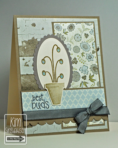
Card Info: Stampin' Up Posy Punch
Stampin' Up Crumb Cake CS and dsp, Razzleberry Taffeta |
Saturate itTo get the full depth of color, you cannot be afraid to saturate the paper.
Here's the front of my circles:
Here's the back - totally saturated!
Circular StrokesColoring in little circles will give you better coverage. If you color back and forth, you will be surprised how often you will notice - often not until the card is entirely done - that you have white streaks where you didn't quite get everything colored.
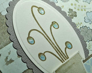
Basic ShadingI am a very simplistic shader. The links that I have at the bottom of this post give you some very artistic examples of light sources, etc. to create amazingly realistic shading. I simply shade around the inside edges to make my image appear to have some dimension - for example, the circles appear more rounded - they have the dimension of darkening toward the "back" and lightening near the "front".
1. Give your image a light coloring with your lighter marker.
2. Before it dries, add your darker marker around the edges. If you do this right away, the "wetness" of the bottom layer will start blending the darker marker by itself. Be sure to use circular strokes or lightly draw "feathers" toward the inside - you just don't want a defined line because it's hard to blend.
3. Color over the whole thing again with your lighter marker. Keep coloring until you don't see the edges any more. Remember - saturating the paper is good! (As I am writing this, I see that my photo does not do justice to the last circle - check out the original card to see what it should really look like!)
**BONUS**
Did you notice the gems on the card? Did you notice that they matched? Gems and pearls can be colored with copics!!! Once you get a collection of Copics, you never have to buy a colored gem or pearl again!
Slightly More Detailed ShadingEven without getting overly "artistic", Copics make it amazingly easy to add a variety of colors to an image.
 |
Card info: Sweet 'n Sassy Spring Tulips
PTI Terracotta Tile, SU Wasabi, Basic Grey Curio |
Layering up colors like this is quite easy.
1. The first step is to add the highlights in the darkest color (you could lay down a light color first to help blending.
2. Then add highlights in the next color.
3. Color over the whole thing with the lightest color - just color until it is saturated and colors are blending.
4. In the fourth tulip, I went back and added some of the darker color again - I didn't want it quite as washed out. You can do this dozens of times. Let's say I add too much of the red, I can color over it again with the yellow and add a little less red. Copics are very forgiving!
Degrees of ShadingIt is often said that if you buy a specific Copic, you should pick up a color that is one or two away from that color. For example, if you buy R22, you should also buy R24 so you are able to shade. (See the examples above on Basic Shading.) I don't necessarily agree. To save money, you can definitely shade with a single pen. Conversely, you may find that you prefer a bigger difference in your shading.
1. The first circle is colored with R22. Then I went back over the edge with the same R22. There is still a shaded difference!!
2. The second circle is colored with R22, then edged with R24, then I went over the whole thing again with R22. There is a little more difference, but is it worth it. I would suggest that if you have a big budget, perhaps it is worth it - but I think the first circle works almost as effectively with one marker.
3. The third circle is quickly becoming my favorite. I colored it with R22, then edged with R27 - a FIVE number difference. I like the richer shading.
It's all preference and if you don't yet know what you prefer - start building your collection with single colors and work toward shading colors after you have figured out what you like.
Shadows and DimensionSo far my examples have been filled-in areas. Copics are also excellent at adding shadows and dimensions. Again, I cannot emphasize enough that I am a VERY basic Copic user. I have put links below in which people create true art with perfect shadows and subtle skies. I believe you can still create a wonderful card with these basic tips.
 |
Card info: Penny Black snowman
Cosmo Cricket dsp, SU Pool Party (glittered), Daffodil, Poppy
Snowflakes are from a Martha Stewart border punch |
So, let's break down the shading on this snowman. It should be subtle, but it makes a HUGE difference!
1. The first snowman has his muffler, hat and the little bird colored. He's cute, but a little flat.
2. On the second snowman, I have taken a light gray marker and run it around the inside edges of the snow. This gives the appearance of a rounded edge, giving this guy a little more dimension.
3. On the third snowman, I focused on popping him from the background. A light line of blue sky makes him appear more "forward", giving it even more dimension!!!
These basic shading colors are a must-have in your collection. I even find myself shading around solid stamps to pop them from their background.
Some recommended shading colors are:
C1 Cool Grey, W1 Warm Grey
(there are light grays than these, but I find they tend to totally fade into the paper) B000 Pale Porcelain Blue
(also B0000 Pale Celestine is a little more subtle so I use it on more subtle cards) Y000 Pale Lemon
(for a sunny background)Coloring FacesThere are a few markers that you are going to want to pick up to color faces.
 |
Card Info: The Angel Company Dear Friend
SU Regal Rose, Pretty in Pink, Saffron, Bashful Blue, Pear Pizzazz |
Sitting here in Parker, CO, I generally have one set of markers that I use for faces. I color the face with E50, I shade it with E51 and I add rosy cheeks with R20. The I Like Markers blog has this
detailed post on various skin colors.
**BONUS**
Did you notice the polka dots on her shirt? I used a Copic Colorless Blender. I think this pen has been named incorrectly. You do NOT need it to blend colors as I have previously demonstrated. What it does is pick up color. For her shirt, I just dabbed it around to pick up some color and lighten the polka dots. I also know that it is used to pick up mistakes like when you color outside of the lines. Frankly, I have never had much luck with that, although I have seen great demonstrations. You can see by the close-up of this little girl that I didn't even try to pink up the pink smear on her back!
TIPS AND HINTSDoes cardstock make a difference?Yes. My absolute favorite cardstock comes from office supply stores - Neenah Classic Crest 80 lb. Cover Stock. I use Solar White for white and Natural White for off-white. I actually buy it by the ream as I use so much of it, but many on-line stamp stores sell packs of 10 of each color. Two that I can quickly think of are
Ellen Hutson and
Sweet 'n Sassy and I know there are many others.
From some of the main companies - I know that Papertrey's cardstock and Gina K's cardstock is recommended. Stampin' Up's Whisper White is not recommended. It has a bit of a glossy coat and the ink just doesn't blend well.
Does ink make a difference?Yes. As a rule of thumb, think opposite. If you are
water-coloring, use
alcohol-based ink like Staz-On. For
alcohol-based coloring with Copics, use
water-based dye inks. And even dye inks seems to have differences that I can't explain, e.g. I get smearing with Stampin' Up ink and copics. DO NOT use Staz-on with Copics - it's alcohol based and will smear and get into the tips of your markers.
The inks that I use for copic-coloring are Memento and Adirondack. I have a black pad and a brown pad from each of them that I use everytime I bring out the copics!
Some people do have a problem with printer inks when you are using digital stamps. I have a Canon printer, I used to have an Epson - and I haven't had a problem. BUT...I also color a little more carefully - I don't necessarily just color across the image - I pay attention to the image lines to avoid any potential smearing.
Best places to buy Copics:There are many on-line stores that have multi-packs of Copics that are reduced. I have mixed feelings about multi-packs as I built my Copic collection based on Stampin' Up/Papertrey groups of colors. Multi-packs could give you a bunch of colors you rarely use thus negating the savings.
Our big box stores - Hobby Lobby, Michaels - do carry a small line of Copics. When they are on sale, it's a great place to start.
If you are a Papertrey user - they do sell sets of three to coordinate with their various colors.
My favorite online store is
The Merri Artist. Their prices are some of the best, their shipping is reasonable and fast.
How do I budget my purchases? Where do I start my collection?1. Are you a Stampin' Up or a Papertrey user? In the right column, I have downloadable charts of the Copic matches to both of their colors.
2. Do you have a favorite color group? I really like the Stampin' Up Brights collection, so I would start there.
3. Do you want to immediately start with a coordinating lighter or darker marker (see "Degrees of Shading" above)?
4. Do you do faces? If so, pick up E50, E51 (shading) and R20 (cheeks) for basic "caucasian" coloring. Or check out some of the advanced videos below for other color schemes. Also...the I Like Markers blog (noted below in "Links") has this
detailed post on various skin colors.
5. You want a couple of very light colors on hand for the shadows and dimension. I like Shadows: C1 Cool Grey, W1 Warm Grey, B0000 Pale Celestine, B000 Pale Porcelain Blue, and Y000 Pale Lemon.
How long do they last? Are they refillable?Yes, they are refillable, but frankly, in the four years that I have been "using", I have never had to refill a marker. I have very little to offer you here - except...if you ever have to refill, before you invest in the equipment and refills, check if any of your local stores do it. We have a store in the Denver area that keeps all the refills and will do it for a small charge - MUCH smaller than investing in your own equipment and refills!
CHARTS FOR STAMPIN' UP and PAPERTREY INK
I use Stampin' Up cardstock and Papertrey Ink cardstock. I love having coordinated sets - so I have the ribbons, buttons, brads etc for the color lines. A logical extension is that I have created reference charts for Copic markers. So...if I am doing a card with Crumb Cake and Rich Razzleberry, I pull out my chart and start coloring!!
These charts are my gift to you!! Just go the right column and find the DOWNLOAD section. Click each chart and when it comes up, use the File button on the toolbar to either Save it or Print it. The boxes on each chart are left blank for you to fill in as you build your Copic collection. Be sure to print your copy on the same paper that you will be using for stamping so, when you color in the squares, they will be the same color that you will be getting on your cards.
The matches on this chart come from many different sources. I have studied the forums on Splitcoast, I have studied the blogs of Copic experts and, when I still don't like the matches, I have actually thrown my own "opinions" into the charts. (FYI - I am particularly fanatical about greens so those blends are all mine.)
It is VERY important that you know that paper does make a difference. It is possible that something I feel is a perfect match on my preferred cardstock, Neenah Classic Crest (details below) may appear different if you are using something else. I don't think they will be radically off - but just wanted you to know!
BASIC COPIC CHARTS
It is handy to have a chart of ALL of the available Copic colors. Then, when you make a purchase, you can add a dash of that color to the appropriate square in the chart and (1) you don't run the risk of buying duplicates and (2) you can use that chart to find the color that you like.
Sharon Harnist has great charts on
her blog. I use the first "blank chart" of all 346 Copic colors and the 24 Spica Glitter colors to use keep my inventory.
There is also an iPhone/iPod app that easily tracks your stash so you don't make duplicate purchases. Just search for "Copic Collection" in the app store.
Basic Copic use:A book by Annie's Attic called
Copic Coloring Guide (and also two new books on coloring nature and coloring people) is a very nice resource. (I have also seen it at Archivers). It starts at the VERY beginning with types of markers and the coding on each one. Then it goes through basic coloring and blending tips. The pictures are nice and the card samples are basic, yet cute. (Annie's Attic also has a good book called
Coloring Techniques for Card Making that includes colored pencils, watercolors and even some basic info on Copics.)
Danielle, on her Neat & Tangled blog, just did
this post with a video of her using Copics on a butterfly. It's so easy to see the idea of circular strokes, feathering and blending when you see it done! She also says she will be doing further posts on Copics.
The ultimate online Copic guide is the
I Like Markers blog. Marianne is the product director/specialist for Copic markers. She started a blog in 2008 to demonstrate every aspect of using the markers. She goes through best papers, best inks, basic colors, etc. But the trick to using this blog is to start reading it in reverse!! Think of it like an instruction manual. Her first posts give you the basics; her recent posts are very advanced.
For advanced techniques:In my disclaimer at the very beginning of this post, I mentioned that I was not Copic-certified. If you ever want to really learn about the full potential of these markers, watch the
I Like Markers blog for a certification class near you.
You will be blown away by the amazing fall leaves on
this post on the Prickley Pear blog spot. They give a dozen different color combos and samples.
Amy Rysavy, on her
Prairie, Paper & Ink, has done dozens of videos on coloring with Copics. She's in the middle of a series of Christmas cards that are amazing. Amy is a true artist with Copics (as compared to my simplistic style). Check out
this post and video to see the attention she gives to a face! Amy's blog is worth watching as her videos are detailed and informative.
This YouTube video with a great demonstration of blending techniques. She discusses "palette blending" and "feathering".
This video and
this one by Kristina Werner are great with faces and hair.
There are hundreds and hundreds of videos out there - I just selected these few to give you a taste of how Copics can work.
ARE YOU EXHAUSTED and OVERWHELMED??I am actually hoping that that is not the case. My goal was to show you how truly easy it is to use these wonderful markers and create art - even without any expertise!! They are an expensive investment, but I find that they are one of my most used tools - and I wanted to give you the knowledge and direction to try them for yourselves.
Please feel free to ask any questions. I may not know the answers, but I will likely know a direction in which to send you!
Enjoy!!