I also decided that I had better start using the various supplies that I had purchased and the various techniques that I had learned on a recent Tim Holtz class from Online Card Classes. I adore his techniques - the amazing colors - but I am not a vintage/grungy person. I wish I could be better at it - I love it when I see it - but I cannot create a single thing that I like. So I am challenging myself to use the techniques (and all the supplies that I purchased!) on simpler cards.
What do you think?...
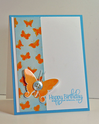
- Stamps: Papertrey Ink Beautiful Butterflies
- Paper: Stampin' Up Tempting Turquoise, Ranger Glossy White
- Ink: Ranger Archival Ink Venetian Orange, Distress Inks in Tumbled Glass and Faded Jeans, Stampin' Up Tempting Turquoise
- Accessories: Papertrey Beautiful Butterflies die, Aqua Mist button

No comments:
Post a Comment